Prototype
Iterating on our design ideas and making them higher fidelity. Our work includes paper prototypes, usability testing, annotated wireframes, and high fidelity mockups.
Paper Prototypes
Using information architecture as a guide for the structure of the pages, we have three most important features - health data measurements, online vet advising, and pet profile. Paper prototypes are easy for us to create and edit, making it ideal for usability testing in the early stages of the project. We made paper prototypes together for the layout of the pages and the flow for the different features of the application. Our paper prototype featured three key user tasks:
-
Check the pet’s body temperature on May 16th at 2:00 pm and store the data.
-
Add the scanned document, 5/14/19 Vet Visit, to the pet’s health information
-
Start a chat with the highest rated vet in the area and send them a picture of the pet

Key Takeaways
-
It is difficult to create novel interfaces from scratch
-
Modeling some features of our app on common conventions of design helped users be more familiar and comfortable with the interface.
-
We need to put ourselves into the user’s shoes to think about how each interface should be laid out and how information should be displayed.
Usability Testing
To test the flow and function of our paper prototype, we conducted three rounds of usability testing. Each participant was asked to try and complete three key tasks with the prototype given with little to no guidance from us designers. By observing where the participants struggled and where they quickly found the next step gave us vital information about which parts of the design needed to be modified and what works well. We also asked the participants to tell us which parts of each task was most difficult to them, why, and any suggestions on how we can change the design to better suit their intuition or expectations.
Key Takeaways
-
Having clear tasks and instructions is very important in this process.
-
Asking questions during the process can be very helpful. We were able to find information on what, why, and how is the user confused in our prototypes.
Annotated Wireframes
Then we created medium fidelity annotated wireframes for every page in our mobile application based on the suggestions we collected from usability testing. We redesigned the current measurement and history pages by changing the order of steps. We modified the position of some buttons and icons in order to make the next step more clear and understandable. These wireframes allowed us to have a big picture for the whole application and prepared us to get more critique before we start a high fidelity mockup.
Wireframe Flow Examples


Key Takeaways
-
Looking at design foundations can be really helpful in terms of position and button sizes.
-
Clear annotations are very important for our viewers to understand the decisions behind our designs.
High-Fidelity Mockup
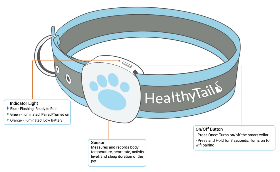
We chose pages of several main features of our mobile app and the physical SmartCollar to transformed them into colorful, visually-appealing, high-fidelity mockups. We keep colors consistent in all pages and replaced less-detailed boxes, icons, descriptions with detailed, higher quality versions. Throughout our design, we also made iterations and actively reach out for feedback to improve our mockups.


Key Takeaways
-
It is important to think about the size of the screen, some of our text looked fine on our computers, but would be too small when displayed on a cell phone screen.
-
It is important to have a clear visual hierarchy, consistent colors, and intuitive positioning of items.
-
It is important to not have distracting elements in a prototype.
-
Presentation of information is important. The interface should not be too sparse or crowded.